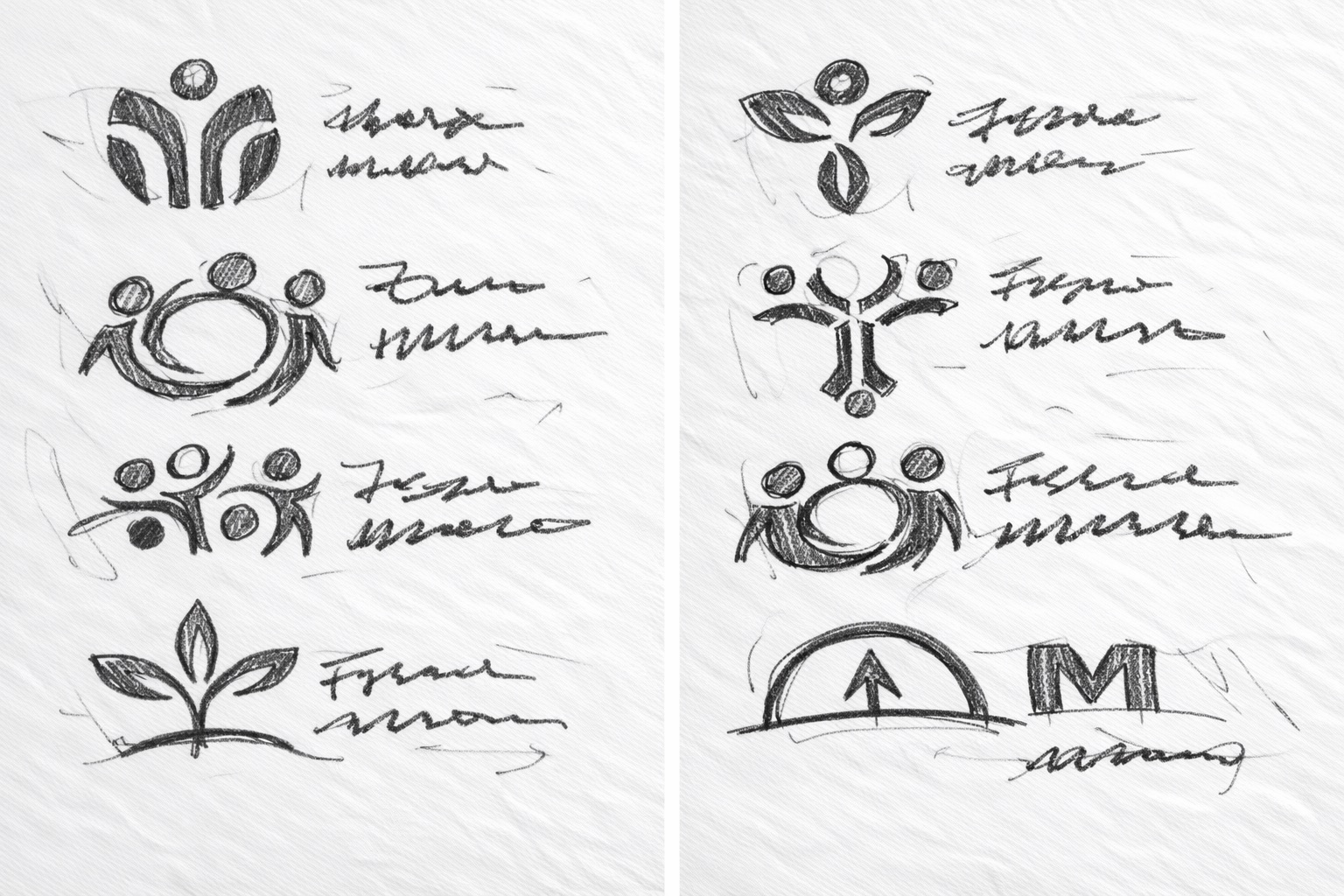
Stage 1 — Early Exploration Sketches
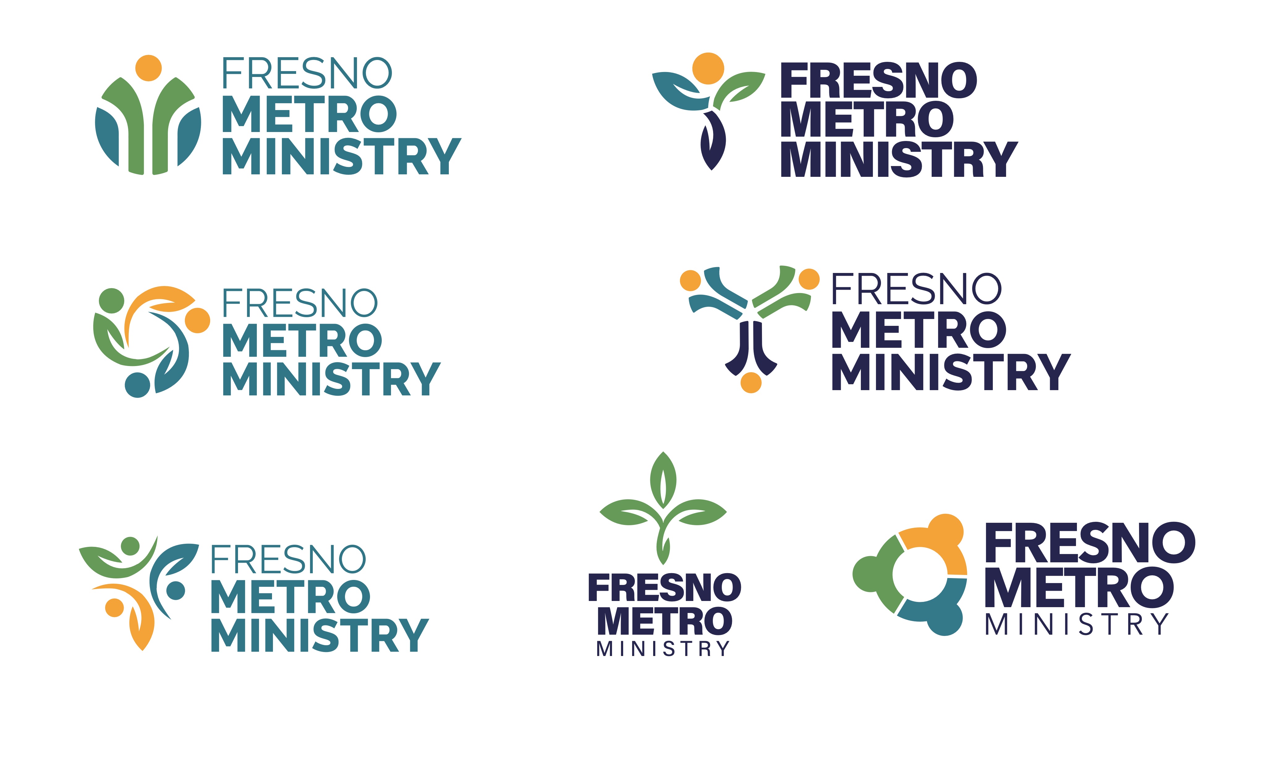
Stage 3 — Digital Concepts Presented to Board
Fresno Metro Ministry came to me with a logo that had aged out of their mission — outdated, impossible to use across platforms, and disconnected from the five programs they run. They needed a full brand system, fast.
Fresno Metro Ministry has served the Central Valley for over 50 years — advocating for food security, running urban farms and community gardens, providing nutrition education, and coordinating Fresno's food distribution network. Their tagline says it all: "Learning, Connecting, and Engaging to Achieve Healthy People and Healthy Places."
But their logo told a different story. When they reached out in July 2025, the brand had three clear problems that were showing up every day in their work.
On top of the logo itself, they needed a complete brand system that could unify five programs under one parent identity — each with enough visual independence to be recognized, but clearly part of the same family.
Before opening Illustrator, I sent a detailed branding questionnaire to the FMM team. Their answers shaped every decision that followed — from icon direction to font choice to how tightly the sub-brands would track the parent identity. What came next was a three-stage design process.
Loose thumbnail sketches exploring the full range of directions: figure-based icons representing community and people, plant and growth motifs tied to FMM's food security work, cross and faith-rooted symbols, and abstract monograms. No idea was off the table at this stage.
The strongest directions from round one got tightened up. Icons became more intentional, proportions got worked out, and the wordmark "Fresno Metro Ministry" was sketched alongside each mark to test how the full lockup would read. This is where the figure-based concepts started pulling ahead.
Six refined digital concepts were presented to FMM leadership and the board, each in full color with the Roc Grotesk wordmark. The board voted — and selected the bottom-left option: a dynamic figure with leaf arm and flowing form, communicating community, growth, and movement all in a single mark.
The full brand package gave FMM everything they needed to launch confidently — and keep things consistent long after handoff.
Horizontal, vertical, icon-only, and wordmark-only versions in full color, black, and white. All formats: AI, EPS, SVG, PNG, JPG.
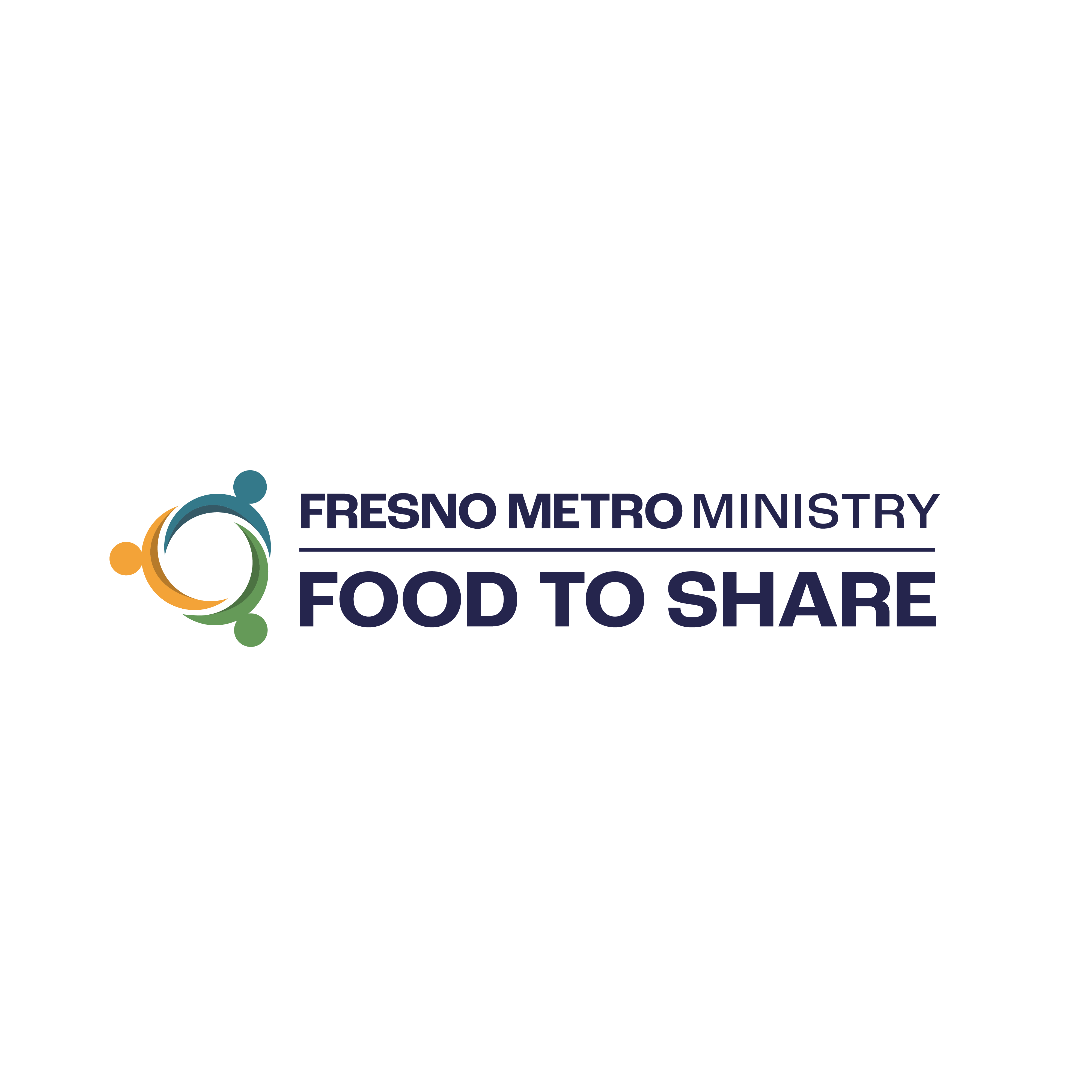
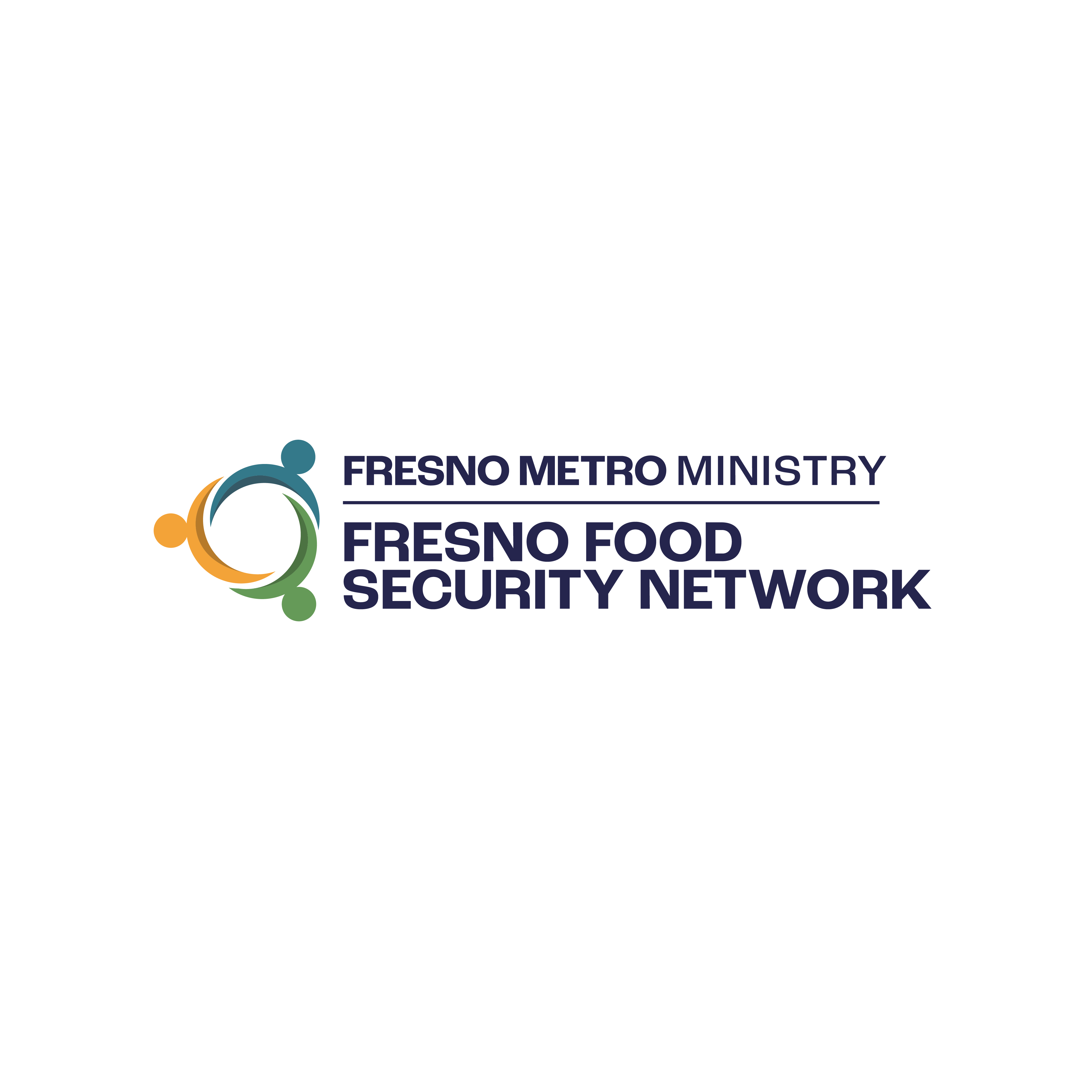
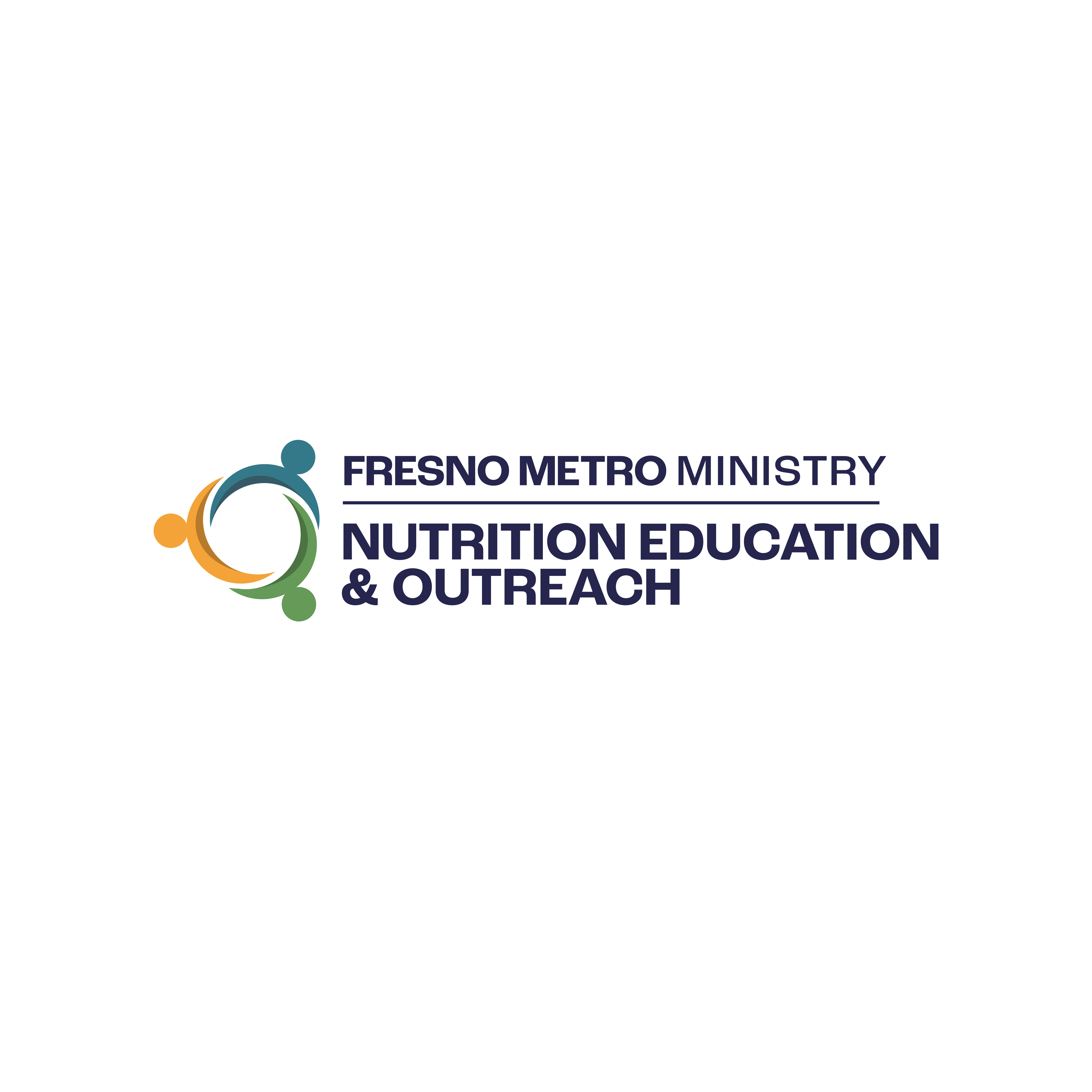
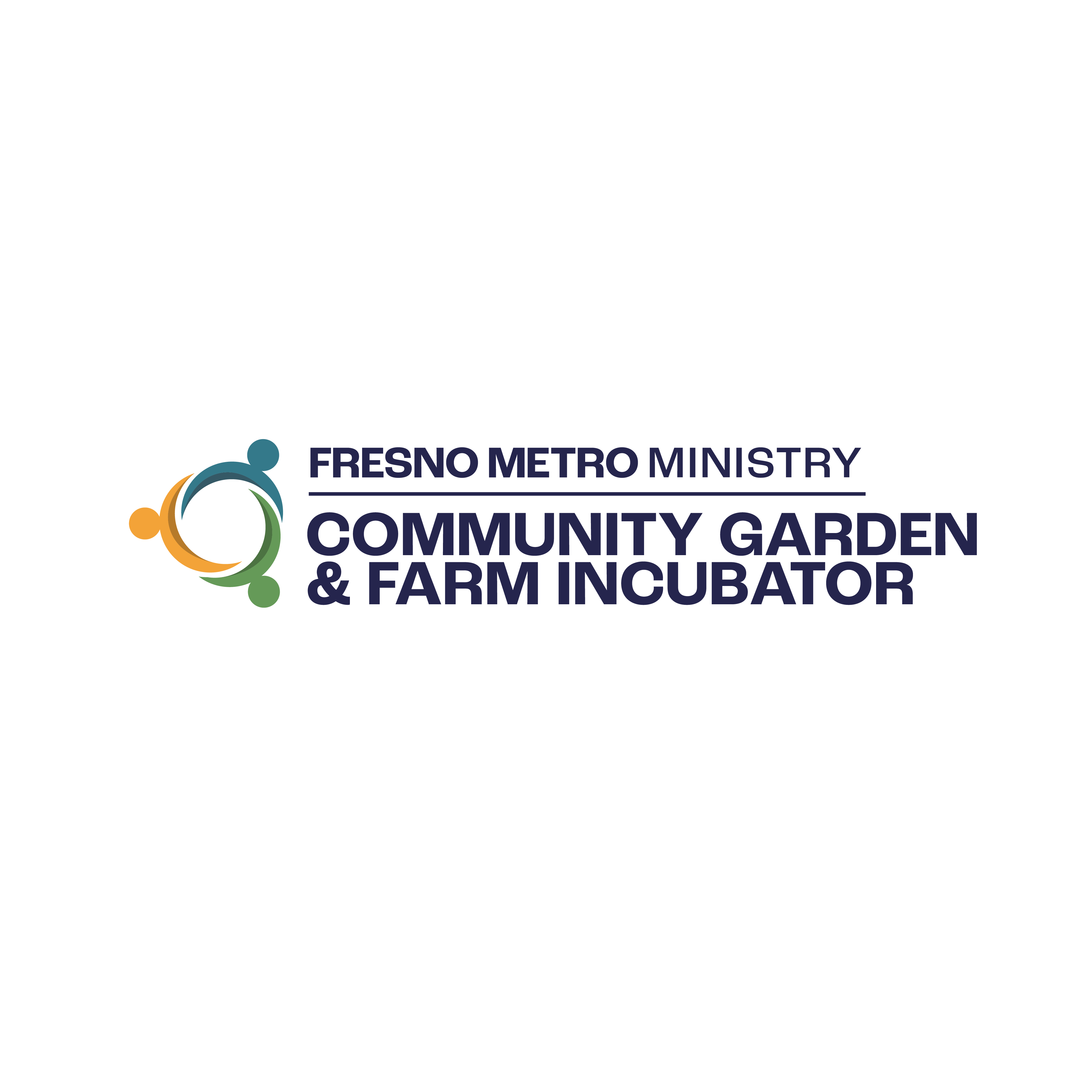
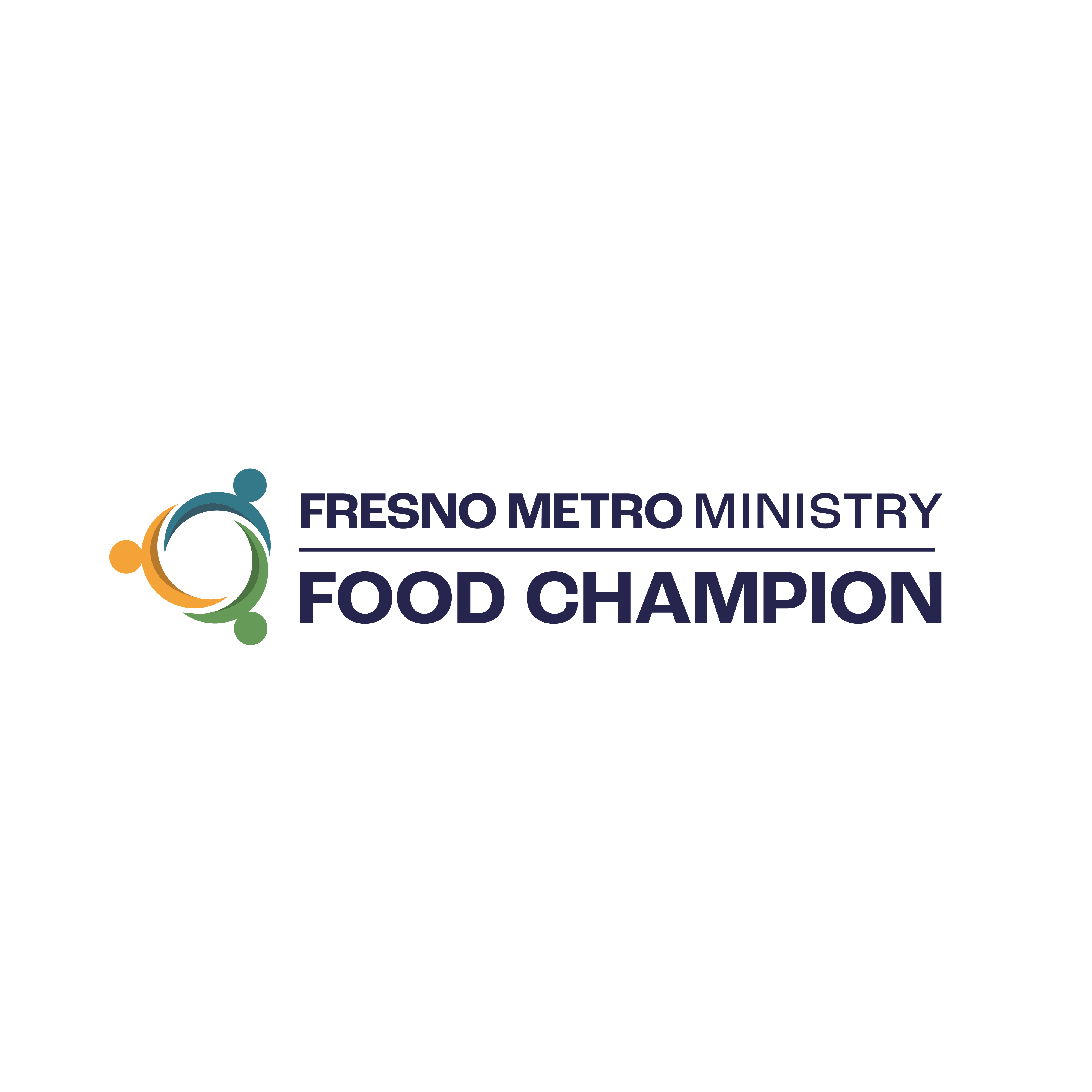
Five program logos, each visually linked to the parent brand through a shared symbol — cohesive as a family, distinct as individuals.
Full brand guide covering logo usage, color palette with codes, typography system (Roc Grotesk), and do's and don'ts.
Canva template with QR code on the reverse. Any staff member can duplicate the template and update their own info in minutes.
Microsoft Word format — branded, print-ready, and easy to update. Includes address, phone, and website.
Uniform HTML email signature for the full FMM team. Copy, paste, and personalize — no design knowledge required.
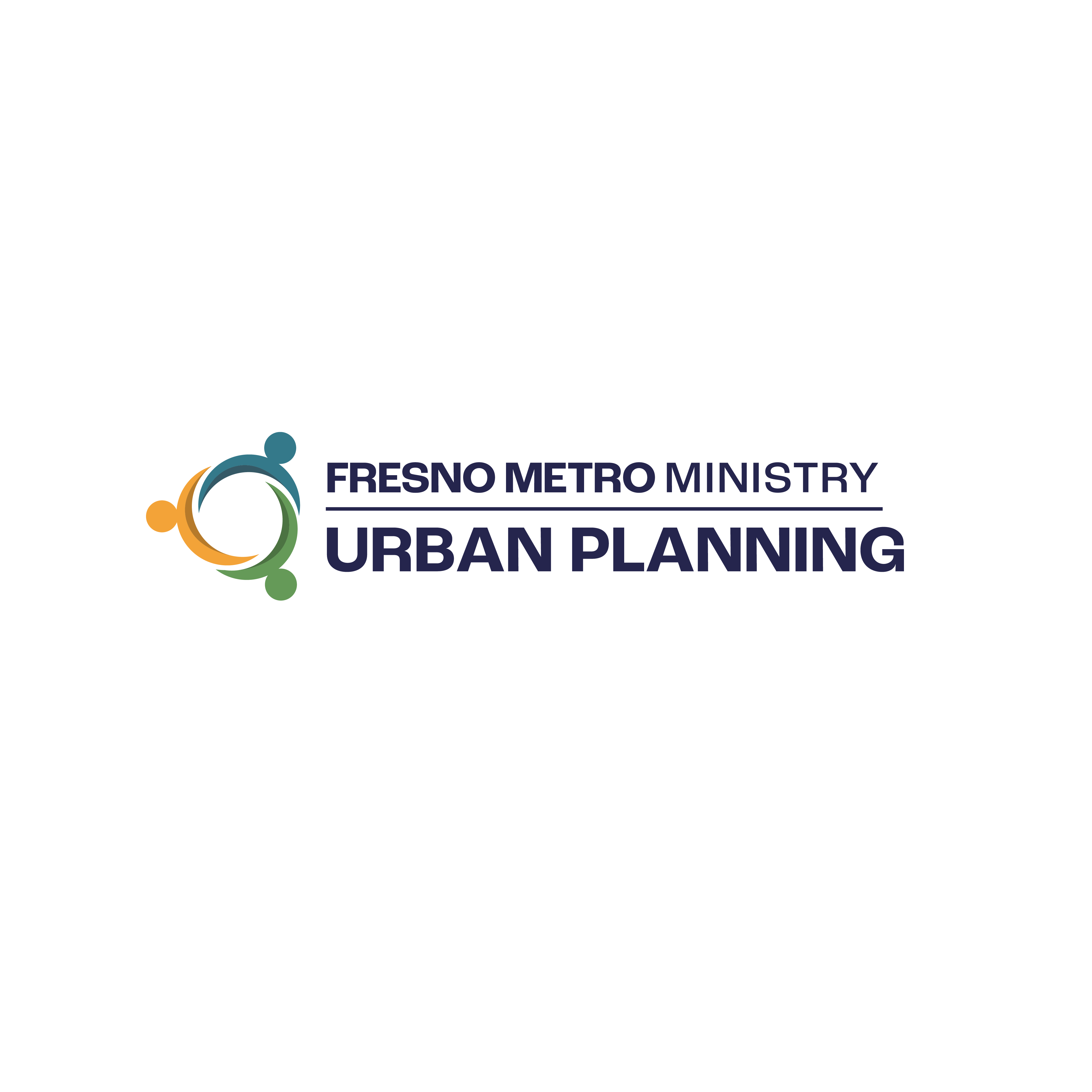
The board selected Option 2 — a circle-and-cross mark paired with a custom wordmark set in Roc Grotesk. The system works across every context: light backgrounds, dark backgrounds, embroidery, and digital.
Each program got its own logo — sharing a common mark with the parent brand while expressing its individual focus. The result is a family that reads as unified on signage, packaging, and print, without any one program getting lost under another.
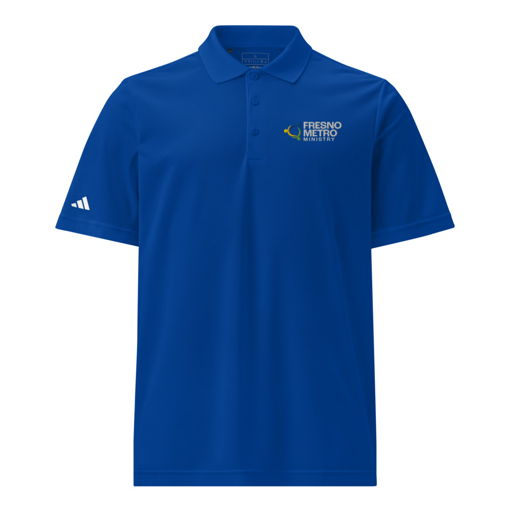
Staff shirts were among the first items to use the new mark. Embroidered on polo shirts, the icon-only version holds up perfectly at small sizes — exactly the kind of real-world test that reveals whether a logo system actually works.

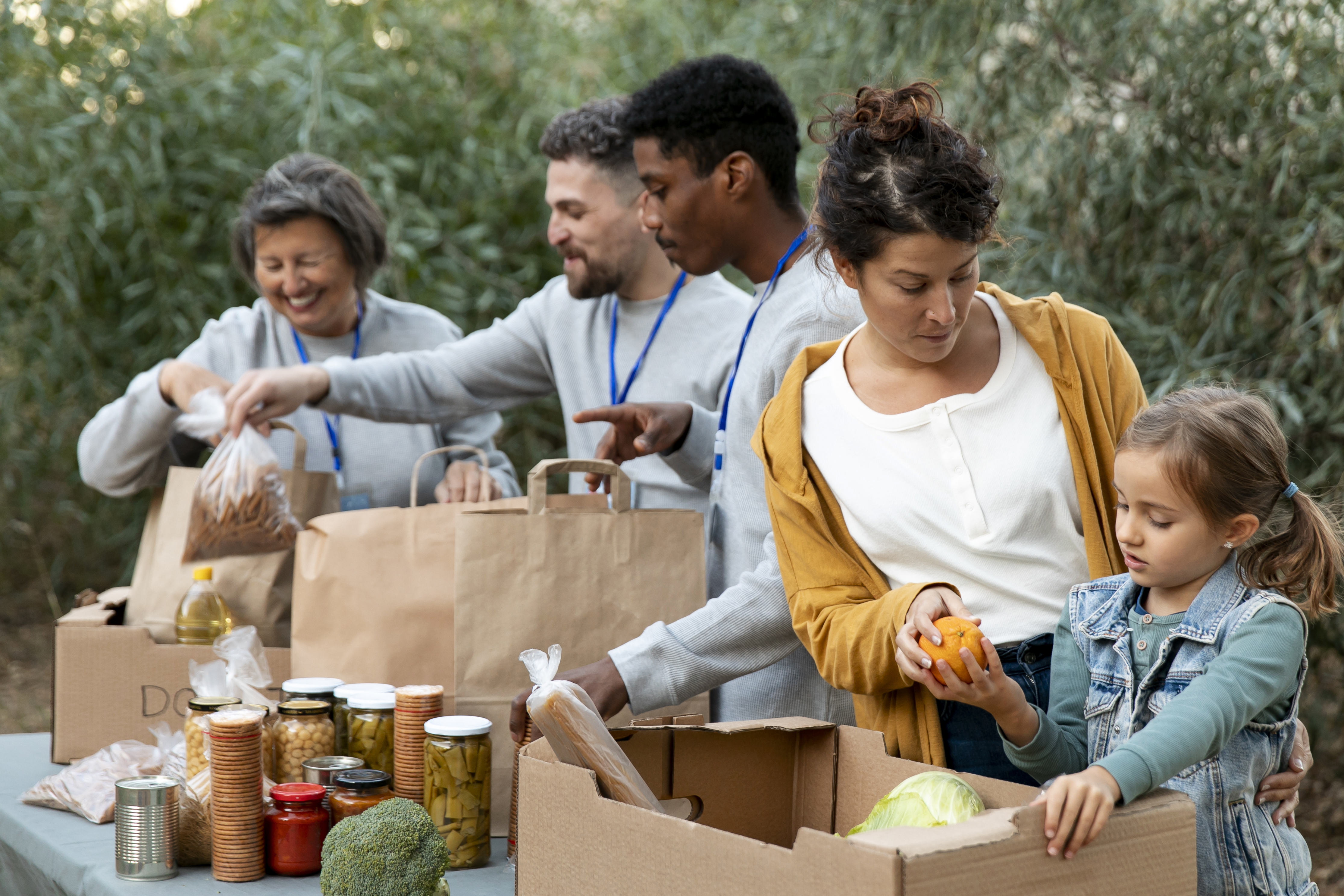
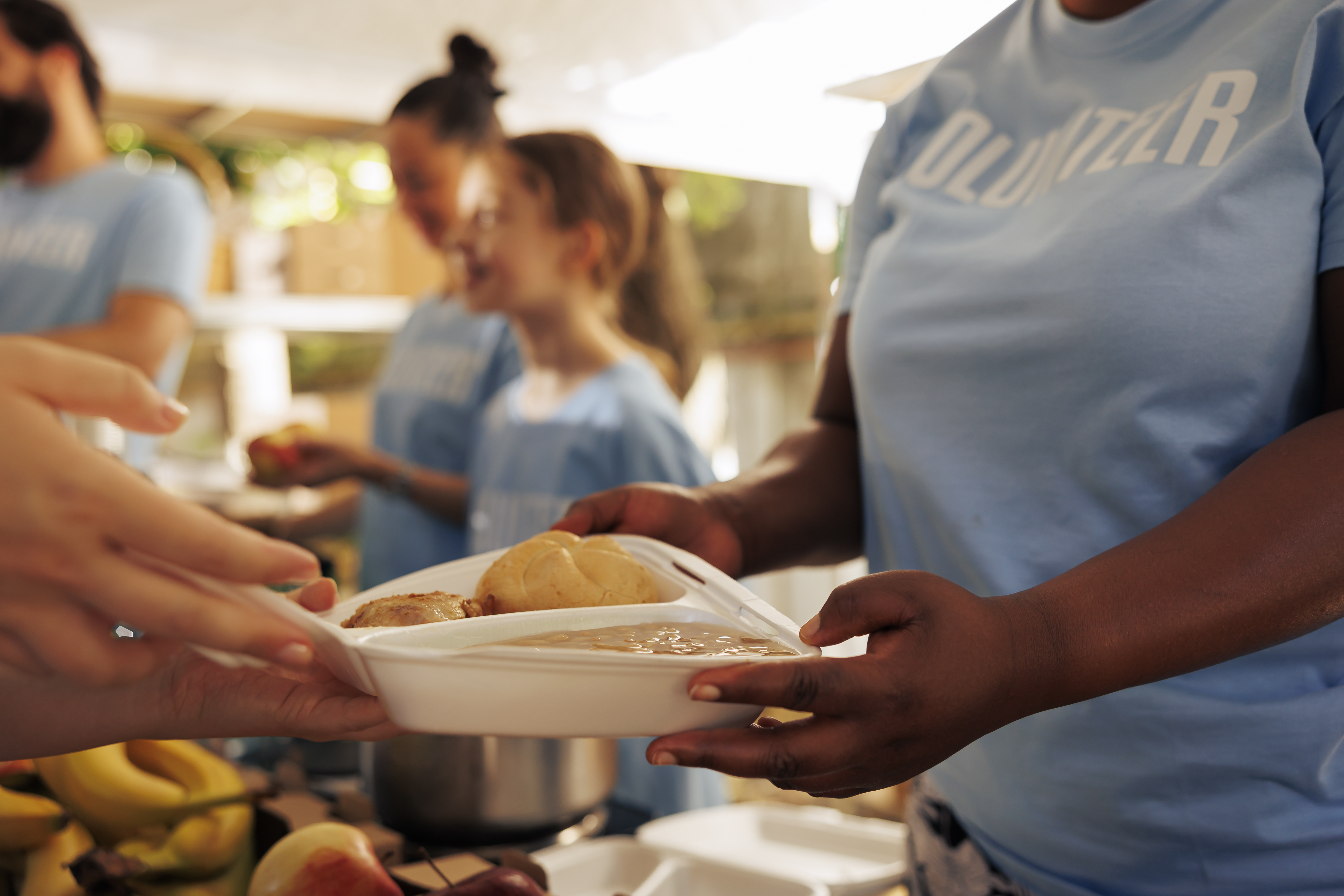
The photography direction in the brand guide reflects FMM's mission: real people, real food, real connection. The visual system was built to complement this photography style — earthy, warm, and human-centered.

By December 2025 the administrative team had signed off, business cards were printed using the new design, and FMM was preparing to officially launch the rebrand at the start of 2026. The entire process — from branding questionnaire to final file delivery — ran about five months, including board review cycles.
"On behalf of the administrative team at Fresno Metro, we would like to thank you for all the incredible work you did on our new logo and branding. Your attention to detail and responsiveness made the process seamless, and we truly appreciate it. We've already printed our new business cards using your design, and they look wonderful!"
This project mattered to me beyond the design work. Fresno Metro Ministry is recognized by the White House for their commitment to ending hunger and building healthy communities — and I grew up in a Valley where food insecurity is real. Getting to help an organization like this show up more confidently in the world is exactly the kind of work I want to keep doing.